top of page
to understand and be understood


home

FRIDGE FONT
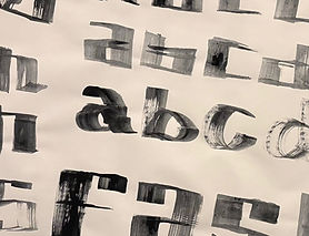
Using mark-making to construct shapes that evolve into letterforms. Whilst still experimenting with analogue mediums, I also vectorised my typeface. This could then be manipulated again digitally to test the tonal quality of the letters once stretched. Adding contextual suggestions brought the 'Fridge Font' into a realm of appropriation. It felt blocky, yet with soft edges. Compartmentalised and squat, it is bold and approachable. You will definitely notice that the lowercase letters follow the same height; that is purposeful. It reads as one and takes longer, to provoke engagement and a little fun.


bottom of page